

Building a user friendly and high performing large-scale application is no easy feat. Having little to no experience in much of the development I was about to endeavor in, I set out to build something that I could only rationalize through my own stupidity — that is, if I was going to fail, I may as well fail big.
In this post, I’ll walk you through my journey of what it was like bringing an idea from inception to reality, including all the hurdles faced along the way.
Hurdle 1: What the heck do I want to build?
Yes, I went into this knowing not what I wanted to build, but only that I wanted to build something complex enough in nature that it would venture me into unknown territories of software development. I had only one goal in mind — I wanted to learn. That’s right; no deadlines; no cutting things from scope; no taking shortcuts.
While many other ideas crossed my mind such as a building a predictive model on covid cases or a centralized app for your data transparency needs, I decided to build a sports betting exchange. Ok, at this point I’m assuming many of you are asking “What is a sports betting exchange and why in the world would you build one?” so let’s run through a quick sports betting 101.
Sports Betting 101
Definition: Sports betting is the activity of predicting sports results and placing a wager on the outcome.
The odds: If I predict that the Lions are twice as likely to beat the Patriots, I would place a bet at -200, or 2 to 1, returning 1 dollar of profit for every 2 dollars I bet.
The opponent: In the world of typical sports betting, one places bets against a sportsbook or bookmaker the same way one would bet against “the house” at a casino.
The profit: While a casino always tilts the odds in its favor, so does a sportsbook. In fact, since you always bet against the sportsbook the odds are set up in such a way that even when you win, the sportsbook takes 10%, also known as “the vig”. Additionally, since a sportsbook wants to minimize the risk they’re exposed to while still making 10%, they occasionally move these odds, sometimes referred to as “the line”, so that an equal value of bets are placed on both sides, leaving them to “cover” a small amount of bets remaining.
The interface: As if this wasn’t confusing enough, most online sportsbooks are cookie cutter replicas of one another, looking something like the following:


A Betting Exchange
A betting exchange does the same thing as a sportsbook, but rather than betting against “the house”, people simply select the odds they’re willing to bet at and the exchange executes the bet if there exists a bet at those odds or better for the opposing team. If not, the bet gets added to the exchange until a bet arrives that meets that criteria. Similar to a stock market, the market odds reflect the last odds that a bet executed at in the exchange.
The betting exchange I set out to create would achieve the following:
- Eliminate the 10% vig collected by sportsbooks by betting peer to peer via the exchange
- Bring an intuitive UI so anyone could understand sports betting
Ironically, Robinhood brought stock trading to the masses by accomplishing similar goals of simplicity and the elimination of trading fees.


I wanted to define what it was I was going to build so I started with the UI. The only issue — I had absolutely no experience in any UI/UX design, thus came the first reality check.
I started by reading anything and everything I could get my hands on but two resources really stood out to me:
So I set out to design a conceptual model for what I was about to build.
Conceptual Models 101
Definition:


My Conceptual Model
After going through a few examples of conceptual models, I broke out my LucidChart app and gave it my best shot:

After many iterations of what goes where and how does one thing relate to another, I finally knew conceptually what I wanted to build, I just had no idea what it was going to look like — thus came the process of user flow design.
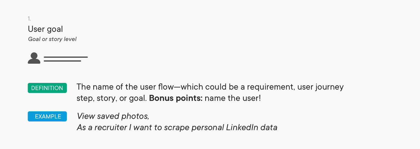
User Flow Design 101
Definition: A user flow is a series of steps a user takes to achieve a meaningful goal.
Goal: Define over time, with higher resolution, the flow a user will take to perform an action while maintaining the ability to iterate quickly on designs.
Overall Process:


Wireflow:

User Flow:

My User Flow Design
- Create an account
- Place a bet on the exchange
- View your bets that were placed on the exchange
- Cancel bets that haven’t been executed yet
- View portfolio performance
- Add friends
- Remove friend
- Refer a friend
- Bet with friend
- Accept/decline/counter a friends bet offer
- Withdraw money from bet account
- Deposit money to bet account
- View pending deposits/withdrawals
- Add/remove a bank account
- Change password
This list is by no means all encompassing but it was a good place to start. Next, I had to break each of these items down by the actions I would expect a user to take in order to achieve each goal. For the sake of brevity I’ll show just one example.
Task Flow:
Place a bet on the exchange.
- Search for your event you want to bet on
- Select your event to view the market odds, graph, bet volume, etc
- Choose your order type
- Choose your order amount
- Place the order
- Get a confirmation email that the bet executed
After defining this for each user goal, it was time for the hard part — the wireflow. Again, I broke out my LucidChart app and started iterating.
Wireflow:

For those of you wondering, no, I most definitely did not get this on my first try… or my second… or my third. This was quite the difficult process, especially when making sure that each task flow was covered in the diagram.
The next step in the UI/UX journey was the user flow. At this point, we should essentially be able to see, in detail, what each of these pages would actually look like on the site. I knew LucidChart wasn’t going to cut it anymore and researched proper prototyping tools. That’s when I came across Figma, a free web-based graphics editing and user interface design app.
User Flow:
There were two things I figured out right off the bat. First, this too was going to take many iterations. And second, there was a reason I failed art class in the 6th grade. While I don’t have every iteration, here are two designs that didn’t quite make the final cut. Side note, if you’re seeing some similarities to Robinhood’s design with regards to the event page, yes, I did find some inspiration from their sleek design.


After realizing the table views had to change as well as the entire portfolio page, I did a redesign including what this might look like on a smaller screen.


Over the course of my software development experience, the largest front end I had built was a single page React-based web app imitating the basic functionalities of Instagram in a Web Systems course. Based on the wireflow above, I knew the development effort was going to be at least a magnitude larger, so I started where I always start — read anything and everything I can get my hands on. From a high level, I knew I was going to have to educate myself on the following topics:
- React best practices
- CSS best practices
- React Redux
- React Router
- Local Storage
After heavy research, again, a few articles stood out to me in each category:
React Best Practices
- The 100% Correct Way to Structure a React App (or Why There’s No Such Thing)
- Structuring React Projects — A Definitive Guide
CSS Best Practices
- Style React Components: 7 Ways Compared
- Structuring Your Sass Projects
- A Complete Guide to Flexbox
- CSS BEM 101
React Redux
React Router
Local Storage
Getting Started
With some idea of best practices and project structure under my belt, I decided to get started and lay out the boilerplate to create a React app with docker. Next, I decided to attempt to build the event page of the app, possibly the most core component of the front end. After a few more iterations on Figma, I decided to build the following page:


Based on React best practices, I decided to split the structure of the project in the following way:
- Components: generic React components that are independent of the business context. For example, a button, form, graph, nav bar, etc.
- Pages: this one’s pretty self-explanatory, but essentially the actual pages in the app, such as event, sport, portfolio, etc.
- Containers: sections of a page, built of one or many components, that pass business logic or data to give context to generic components. Examples include EventBets, EventGraph, etc.
In the context of the first page I was hoping to build out, it would be defined as such:
- Components: graph, form, button, and table. Essentially, these 4 components would make up the majority of the site, along with subcomponents that are unique cases of each. In the example of a button, this might be a toggle button or a button bar.
- Pages: EventPage
- Containers: EventBetsTable, EventGraph, MakeBetsForm
What troubled me at this point was the logical flow of development from writing some relatively basic React, html, & CSS, to filling the page with actual data. What I learned was that when starting out, it would be easiest to define static data as part of the state in each container. Then, when the page looked complete, I’d move on to using a mocked API, and finally, when the API was built out, I’d switch the endpoint to use real data.
Redux 101
Overview: Redux is a pattern and library for managing and updating application state. It serves as a centralized store for state that needs to be used across your entire application, with rules ensuring that the state can only be updated in a predictable fashion. The patterns and tools provided by Redux make it easier to understand when, where, why, and how the state in your application is being updated, and how your application logic will behave when those changes occur.
Store: The center of every Redux application is the store. A “store” is a container that holds your application’s global state.
Action: The only way to cause an update to the state is to create a plain action object that describes “something that happened in the application”, and then dispatch the action to the store to tell it what happened.
Reducer: When an action is dispatched, the store runs the root reducer function, and lets it calculate the new state based on the old state and the action.
Subscribers: The store notifies subscribers that the state has been updated so the UI can be updated with the new data.
Mocking Data
Now that we know what Redux is and I’ve finally got the page to look right (after becoming best friends with this CSS Flexbox cheatsheet), it was time to have the page ask an API for the data it was going to use, rather than defining static data in the code itself. The only issue — the API didn’t exist yet. At this point, I knew I was going to have to set up a mocked endpoint. I also knew I was going to have to define the API route, method, request, and response. After some research I decided to use the following tools:
- SwaggerHub: for API Documentation and route definitions
- Mockaroo: for mocked API development and hosting
Defining the route in SwaggerHub took a bit of learning curve but the end result was very much worth it.

Now that I knew what the mocked endpoint was expecting and expected to return, I headed over to Mockaroo to author a quick Ruby script that returned the data which was once statically typed in my React project, however, it’s worth noting that Mockaroo has the capability to set schemas and deliver dynamic datasets with exceptional quality.


Rinse and Repeat
Great! At this point I had the structure of my project, my first page rendered properly, and one container hooked up to a mocked endpoint. Now comes the grind, as I had to repeat this process many times over to build out the rest of the site.
In the end, my SwaggerHub documentation had the following routes:


At this point, I knew I had quite a few other pages to build out such as user signup, user login, a landing page, a banking page, and a friends page, but I decided for now to cut it from scope as the front end consisted of enough to get the core logic written on the backend, returning later to finish up pages that were standard of most web applications.


)
Social Plugin