Betting on football is a fun and exciting experience. The ups and downs, playful banter between friends, and the opportunity to win a bit of cash are what draw users in.
Oddschecker is a company that compares betting odds across the leading bookmakers in 6 countries. The platform serves bettors from all walks of life by helping them find the best odds on every bet.
Oddschecker’s suite of products includes an iOS app, betting widgets, and 2 websites (UK and international).
Project Highlights
Responsive redesign
The Oddschecker international website is currently live in 5 countries and features 21 sports, pulling feeds from over 50 bookmakers.
The website gets a lot of traffic but thanks to a design that is not fit for purpose, most users leave before engaging with the content.
I was hired as a Senior UX/UI designer to identify the main pain points and propose solutions to fix them.
Initial research
There were known issues with information architecture, navigation and interaction design.
The navigation didn’t allow users the freedom to move back and forward in the journey, and the interaction design was inconsistent across the site. The information architecture was not intuitive and did not follow common industry patterns.
Knowing about the issues was a good start, but data from real users that would support or contradict any assumptions was what was required before we started designing anything that would have an impact.
Getting real data
To get a clear picture of the current situation, I used a variety of methods for gathering different types of data.
Qualitative:
- User testing
- Visitor intent poll
- User feedback poll
Quantitative:
- Scrolling behavior heatmaps
- Click behavior heatmaps
- Customer satisfaction poll
- Competitor analysis
Baseline user testing
The Oddschecker customer insights team provided me with details about their users. This allowed me to set up tests that targeted participants who were representative of our user base.
User profile:
- Predominantly male
- 18 – 55 years old
- Places sports bets weekly
- Power users have multiple bookmaker accounts
I set up a test across the whole journey. From the Homepage down to the point where users compare odds and place a bet.
The test was made up of just 5 short tasks, but surprisingly, one video came back that was over 30 minutes long!
Key takeaways:
- 4 users said that finding a specific sport on the homepage was difficult
- 3 users said that the secondary navigation bar is confusing (there is no consistency)
- 2 users said that It’s not obvious what the site does from the homepage
- 2 users said that there is a lot of information to take in
Visitor intent poll
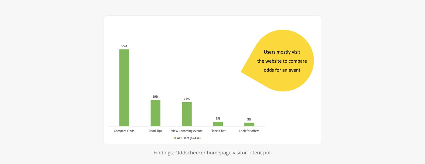
To understand what the main purpose of visit to the Oddschecker website was, I ran a visitor intent poll on the Australian, German, Italian, and Spanish sites.
Key takeaways:
- About 50% of users wanted to ‘compare odds’
- About 20% wanted to ‘read tips’ (tips are blog posts that advise on whom one should bet to win).
User feedback poll
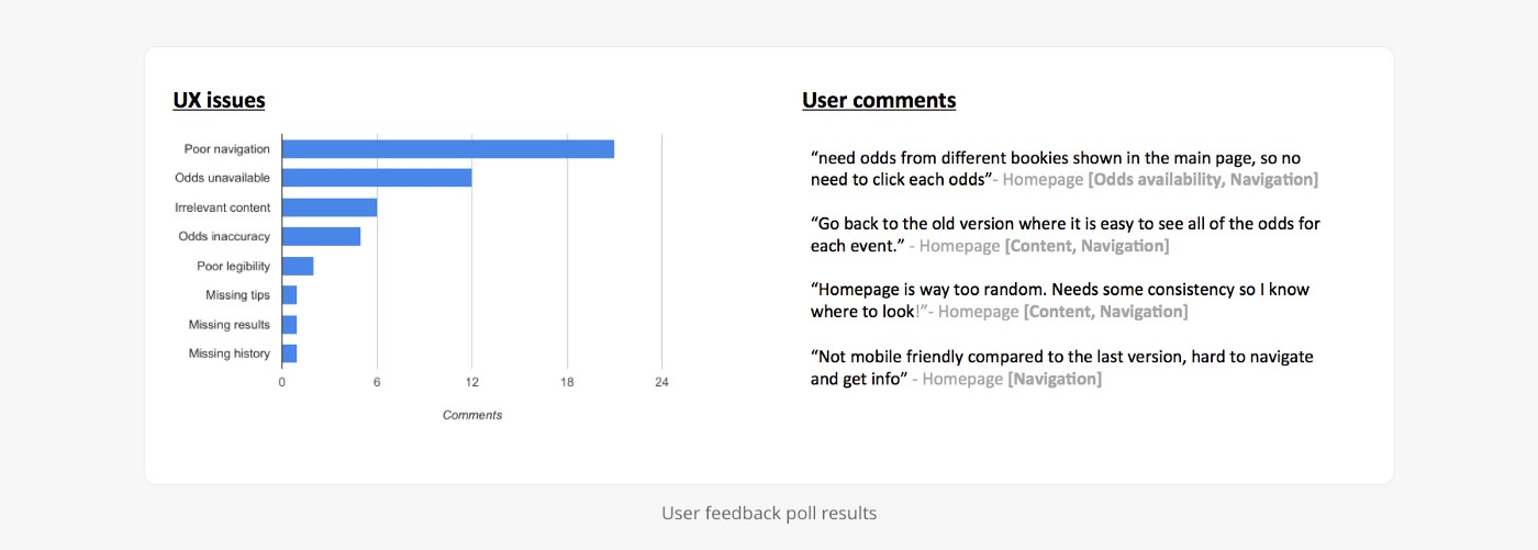
To gather qualitative insights from real users, I ran a user feedback poll that asked “What do you think we can do to improve your experience?”.
The poll received 258 responses. Most of them were rude insults – which was great feedback in itself – but 36 described specific issues that we could use to improve user experience.
Findings
The biggest area for improvement was in navigation and website layout (organizing the content). There were trust issues with the website displaying inaccurate odds, and users mentioned poor legibility and missing content as other issues.
Heatmaps
Heatmaps tracking clicks and scrolling behaviour offered further insight into how real users were engaging with the interface.
Clicks
The search bar and primary navigation received the highest engagement on the homepage. Nobody was interested in the body content – or was the lack of structure off-putting, causing users to resort to using search?
Scrolling
Heatmaps revealed that 80% – 90% of users don’t scroll past the average fold line – highlighting the importance of keeping pages as concise as possible.
Customer satisfaction poll
Customer satisfaction is the simplest way to understand if users like your product or not. Running this poll was a good barometer for how current users were feeling about the site, and how likely they would be to return in the future.
Results
Most users were ‘Somewhat satisfied’ or ‘Very satisfied’ – which is not that great. The ideal scenario is where users are all either ‘Very satisfied’ or ‘Extremely satisfied’. These experiences are more likely to be remembered and result in high client retention, loyalty, and product repurchase.
Conclusion
Initial research had revealed issues all around the website. Some of them were technical limitations (feeds not updating), and others were purely design related. With the start of the football season looming, and traffic expected to peak soon, that journey was top priority for the business, so the directive was to focus on Football.
Football benchmarking
To identify common industry patterns in the sports and sports betting industry I looked at some of the big players that our users were accustomed to.
BBC Sport, SkyBet, Bet365 and Unibet were some points of reference. Another competitor in Australia, Punters.com.au was the most relevant competitor.
The concept of odds comparison is still relatively new in countries outside the UK, so it was useful to have another point of reference to learn from and benchmark against.
Key findings:
- Most sports and betting websites have clear information architecture with pages dedicated to each content type (ie: fixtures, results, tables, live scores)
- Popular football leagues are prioritised above lesser known leagues
- Odds comparison sites have clear call to actions to compare odds
- An intuitive navigation pattern for sports is: Sport (Football) > Country (England) > Competition (Premier League) > Fixture (Team A v Team B) > Market (Match Outcome) > Bet (player)
Wireframes
The first wireframes I drafted clarified topics from different parts of the business.
Main points:
- What will the new navigation look like and how will this work in different countries?
- What sports betting content would be shown and how far in advance should it feature on the site?
- How to commercialise the page with display advertising, offers, and betting widgets
- How can we make the design flexible enough to work in different territories with different league preferences
- How will the new design meet seo requirements without diminishing user experience
At this stage, content managers also fed in requirements and requested features that would improve their workflow.
Product features:
- Fallbacks: when content is unavailable, what should be shown instead
- Customisation: ‘Popular leagues’ should be a customisable section, same for ‘Popular markets’
- Use of popular image aspect ratios (16:9) to make updating content easy
UI design
After agreeing on a set of wireframes it was time to build a prototype and get it into testing. I applied my UI layer and built high fidelity Invision prototypes for mobile and desktop user testing.
Prototype and test
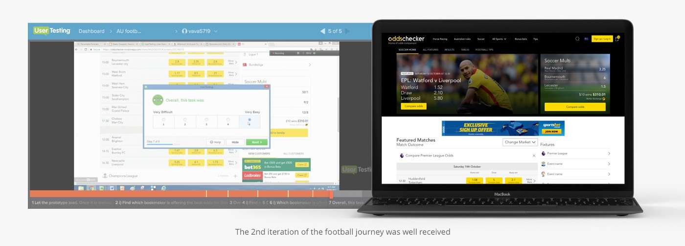
The first test involved 5 participants and produced a usability score of 84. Analysing the videos, I found that there were some issues which could be improved.
Improvements:
- 3 users struggled to find football ‘Results’ as it was only accessible via a date picker. I restructured the architecture to place ‘Results’ and ‘Fixtures’ on their own pages, and simplified navigation from horizontal date picker to vertical scrolling.
- 3 users commented that it would be useful to be able to switch between betting markets on the football homepage. I added a floating ‘Change Market’ button that provided quick access to the most popular betting markets per country.
- 3 users mentioned that they would like to see more supplementary information to help them place an informed bet (ie: related tips, team performance history)
- 2 users commented that the labelling above bet types could be improved. I added home draw, away labels above each bet.
End product
The end product is a football betting journey that scored 94 out of 100 on the usability scale.
Features:
- Shows most popular leagues and betting markets in each country (this is customisable for content managers)
- Popular betting markets that can be adjusted per country
- Pre-built betting widgets are customisable for content managers
- Pages included are Football home, Leagues & Cups, Today’s Fixtures, Football Tables, Live Scores, Tips
- Website is responsive across 5 breakpoints


0 Comments