
Objective: Improving the user experience for decentralized exchanges

Role: User researcher, UX designer
Time frame: 8 weeks
Introduction
I use crypto apps, I own some crypto but the process is still very obscure to me. I’ve always had to reach out to other crypto users to clarify things and that has led me to designing this. The major focus of this app design was to make DEX wallets easier and more usable for the regular user who isn’t crypto savvy and also to shorten the learning curve of crypto-apps.
For the lots that are not familiar with Cryptocurrencies, blockchain technology, and decentralized exchanges, I’ll briefly highlight them.
Cryptocurrency: A cryptocurrency is a form of “DIGITAL MONEY” that can be used to buy goods and services. It is a digital or virtual currency that is secured by cryptography, which makes it nearly impossible to counterfeit or double spend. Many cryptocurrencies are decentralized networks based on blockchain technology.
Decentralized exchanges: Decentralized exchanges, also known as DEXs, are peer-to-peer marketplaces where cryptocurrency traders make transactions directly without handing over management of their funds to an intermediary or custodian. These transactions are facilitated through the use of self-executing agreements written in code called smart contracts.
DEXs were created to remove the requirement for any authority to oversee and authorize trades performed within a specific exchange Learn more about it here
Blockchain Technology: A blockchain is a shared distributed and immutable ledger that holds information about online transaction data, not only for cryptocurrency but for healthcare, food safety, and many more. Each block contains an uncrackable cryptographic hash of the previous block and a timestamp that protects your data. It is immutable which means the details on a blockchain cannot be altered.
The Challenge
The challenge was to rethink and improve the crypto wallet user experience. Krypton is a decentralized exchange wallet that aims at improving the user experience on DEXs. The outcome expects an elegant design solution that is simple yet intuitive and powerful.

Krypton wallet logo
The process
Every good project starts with a good plan. I started with applying design thinking as a problem-solving method throughout the UX process...

5 steps of iterative design thinking process
Design Thinking is an iterative process in which we seek to understand the user, challenge assumptions, and redefine problems in an attempt to identify alternative strategies and solutions that might not be instantly apparent with our initial level of understanding. I would walk you through my process of designing krypton using the five phases of the Design Thinking process.
- Empathize — with your users
- Define — your users’ needs, their problems, and your insights
- Ideate — by challenging assumptions and creating ideas for innovative solutions
- Prototype — to start creating solutions
- Test — to know if your solutions works
Empathize

Empathize phase
- Meta mask
- Trust wallet
- Safepal
- Coinbase wallets
- Blockchain app
- Onto
- Tron link wallet ETC
I interviewed three categories of users; professional crypto traders, regular wallet users, and crypto enthusiasts who aren’t fully into crypto. Started with getting the user’s demographics to be sure they fit into my target audience. Asked questions about their experience using DEX wallets, using cryptocurrencies, what they know about blockchain technology, the blockers/issues they face using wallets, how they think it can be improved, what doesn’t work for them, what motivates them to keep using the wallet, etc
Main research insights
- Potential users are usually skeptical about the topic of cryptocurrency, and It’s still very obscure to them.
- Users are not satisfied with the current backup process on competitors app
- 45% of users have lost access to their wallets due to backup issues.
- DEXs lack intuitiveness and are more suitable for traders who have spent some time in the crypto space, it is not user-friendly for newbies.
- Users complained of using too many crypto platforms for simple actions. They don’t have a single platform that allows them to manage their cryptocurrency portfolio without having to move from platform to platform and lack data visualization of their portfolio/earnings
- Due to trade collisions, the DEXs sometimes attract higher transaction fees
- Users suffer from prolonged order matching time due to the increase in transaction load.
- Most DEX wallets don’t provide an easy way to track transactions/activity
- DEX platforms are not intuitive or easy to use and require a high level of technical know-how
- users prefer to have multiple wallets within a single app so they can keep separate assets from family or use it like bank apps by having multiple accounts for different purposes.
Due to issues faced by Decentralized Exchanges, users tend to lean towards Centralized exchanges. The following chart expresses the trading volume of DEX to be at the lowest i.e. 0.8% (statistics by TokenInsight).

While some of the pain points highlighted are technical issues, I believe a little enhancement in the user experience would go a long way to help more individuals enjoy this technology.
Define

Define phase
In this stage, I put together the information I created and gathered during the Empathize stage. This is where I analyzed and broke down my research insights and observations into chunks in order to define the core problems. I defined my problems and whom I’m solving problems for.
According to competitor research, I observed most of these platforms do not really consider or target newbies or people who are not experienced or learned about blockchain and cryptocurrencies. Those who dabble in the blockchain world know all about smart contracts and how it works, but it is not the work of an ordinary Joe to understand or create a smart contract. This approach has been a frustration and major barrier to entry for some people and has limited their interest in trading cryptocurrencies.
Goals defined:
My goal for krypton is to design a seamless, intuitive, and easy-to-use multi-wallet platform that provides additional values/features that helps crypto traders, holders and other potential users make trading decisions efficiently, exchange, send or receive coins, and backup more securely. How did I achieve this? Let’s find out
Ideate — finding solutions

In this phase, I had already understood the user's needs, analyzed the research insights and observations and I was ready to start generating ideas. The ideation stage required a lot of thinking, I had to brainstorm and identify possible solutions to the problem. I made pen and paper sketches of a few iterations
Some HMWs
How might we provide our users with a better way to backup
How might we make it intuitive enough for both experts and newbies
Some Ideas generated after the ideation process:
- Based on research, I learned most crypto users tend to have multiple coins and prefer multi-wallet apps which I offered in my app.
- I integrated a built-in web 3 browser for secure browser and easy access dApps to browse and trade more securely.
- I provided extra backup options
- I integrated charts and graphs and other trading options to help a user make decisions faster
- I provided an intuitive onboarding to ease new users into the app and provided tooltips to guide a user’s decision-making every step of the way.
For every step in the design process, I kept five principles in mind. These are principles for designing a great UX for blockchain Technology;
- Designing for understanding:
By simplifying the message for the more casual users and understanding their behaviors you can make sure that all the information presented on your website is valuable and clear. With this principle, you can create a UX design for your blockchain platform to use which, the user does not need to have any prior knowledge of the technology. People want to reap the rewards of blockchain technology and a complicated UX riddled with overly technical jargon can become a barrier to clear communication.
- Designing for trust
When dealing with highly sensitive data, maintaining the user’s trust is critical. Users must perceive the applications to be reliable, trustworthy, and stable. This is accomplished through data exposure, consistency, feedback, and active guidance. Designing this into products means providing the user with clear feedback and active guidance through every task.
- Designing for communication
The language used in the applications should be clear, concise, and in alignment with the user’s natural communication patterns.
- Designing for consistency
User experience must be visually consistent across different products. This includes the general layout of the applications, colors, icons, and typography used for the user interface. Leveraging common design patterns results in a reduction in the amount of learning required by the user and having a consistent design puts users at ease. It also enables adoption and learning — which is so important, particularly with new technologies like blockchain.
- Designing for exposure
The best way to educate the users about your product is to provide them with content regarding how the screens work. Telling them in creative ways about how your platforms work is also another way of educating them on your product, which builds user trust. The user needs to understand and see how the application processes work. We should help the user understand how blockchain is working for them to improve their processes, such as data visibility, audit trails, and provenance.
Prototype

This is an experimental phase aimed at identifying the best possible solution for each of the problems identified during the first three stages. My solutions were implemented within the HiFi prototypes, and I reviewed them with some users by conducting A/B tests.
By the end of this stage, I had a better idea of the constraints inherent to the product and the problems that are present. Also, had a clearer view of how real users would behave, think, and feel when interacting with the end product. I designed light and dark themes for better accessibility.
Typography and colors
Before I started my design, I created a basic design system, containing the elements I was going to need to build the Hifi prototype. Concerning colors, I chose calm green and elegant black. Green often symbolizes nature and the natural world and is considered to be the easiest color on the eyes. It is thought to represent tranquility. When we see green our eye requires no adjustment. This is because it is at the center of the colour spectrum, making green very restful, creating balance and harmony.
As for black, it is a color of sophistication and confidence. This color gamut does not distract users’ attention and helps them to concentrate on the main tasks

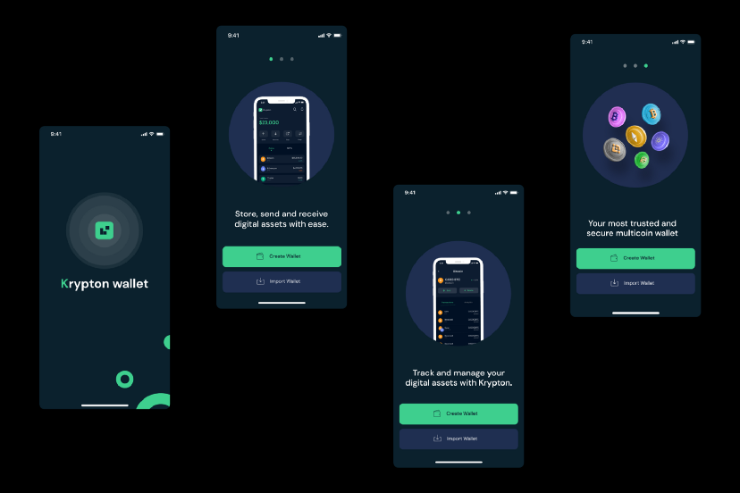
Onboarding;
I designed a splash and intuitive onboarding that throws light on the core features of the wallet. As designers, we’re responsible for guiding our users through this transition since people are still trying to learn about the benefits of blockchain and what it means for them.

Splash and onboarding for krypton light theme
Splash and onboarding dark theme

A better way to backup:
Backup is a crucial step for using crypto wallets. Here, users are asked to write down and keep a secret 12-word phrase safe. The secret phrase is actually the master key for all private keys, if the user loses the secret phrase they lose all their asset forever. But memorizing a full screen of 12 random words before they even can use the wallet is a big ask and not everyone wants to do that. So I’ve given users additional backup options and added a way to educate them on the risks of losing their backup data. ; Although cloud backup is a way of introducing centralization, over 55% prefer to have that option so it’s up to a user to choose whichever one works for them.


Better data visualization of assets
Users can study more about market data easily, can check the track records of the market data, and can easily track transactions of a coin.

More Import wallet options
I gave users more options to import an existing wallet into a new device. For newbies who may not be familiar with this process, I added a “How does this work “ link that opens up a modal to educate them more on this process.


Receive coins flow

Send coin


Swap coins

A web 3 browser to access dApps and browse securely
An intuitive and secure built-in Web3 Browser, to connect wallet and experience the new decentralized web and all your favorite ‘Dapp

A comprehensive settings page
From the settings page, users have the flexibility of modifying their account the way they want. They can back up their transactions/ recovery phrase, they can join communities to connect with other crypto users, they can get help/support and, they can access their multiple wallets.


Other Mockups


Test

Test phase
The next step is to test the prototype. As they say at Stanford’s d.school: “Prototype as if you know you’re right, but test as if you know you’re wrong. I would test the prototype to:
- Identify any potential confusion in navigation
- Validate the existing feature set and navigation
- Gather insight about the current layout
- Possibly eliminate excessive content
- Refine the POV
- Learn more about cryptocurrency and its users, and make the next iteration of the product better.
N/B: Not everyone agrees to the backup to cloud option because it is not very secure. I had to include it as an option due of the majority that complained of losing their wallets because they couldn’t memorize and couldn’t get a hardware wallet.
Conclusion
Designing user interfaces for applications leveraging blockchain technology is an exciting challenge and a totally new experience for me. The closer you get to it, the more it opens up a new set of possibilities. In various ways, blockchain technology brings a real transformation, and when aligned with design thinking could be a catalyst for a new wave of user experiences that may very well change how users interact between themselves and via applications.
There’s always a danger of alienating the user when introducing new ideas and concepts, so it’s critical to have them at the center of the process. Having a strong set of principles at the core of the design process helps with this.
Next steps
- Test this prototype with users, Iterate design, and update this case study.
- Refine my POV and design solution based on feedback from testing.
- Explore more on centralized exchanges.
Thanks for reading through!
0 Comments