
Overview
TT Wallet aims to build an entire ecosystem through an interconnect platform, and features a wallet that allows users to buy, store, keep, and transfer their cryptocurrency assets, as well as enables exchanging cryptocurrencies all within the TT Wallet. This case study aims to provide insights on how and why the TT Wallet was redesigned. This article will also share insights into the redesigning processes involved, which includes:
- Scoping the project
- Defining the problem
- Product design
From this case study, you will gain insights about the new wallet concept and understand how we utilized design thinking to come up with the design concept.

Goals
By redesigning the TT Wallet mobile app, our goal was to create a simple, intuitive, and memorable user experience.
Based on our goal, we aimed to do the following:
1. Allow users to easily understand the DApps on the TT Wallet, and be willing to try out different DApps listed.
2. Increase the assets supported on TT Wallet, such as cryptocurrencies on ThunderCore Mainnet.
3. Develop a quest feature to encourage ThunderCore user activity growth on the TT Wallet, which incentivizes users to try out different DApps and help partner DApps boost the exposure to their DApp.
The Challenge
Throughout the process of designing the UX (user experience), we applied design thinking as a problem-solving method.
Blockchain is a disruptive technology that has a potential to change the economy and social systems. In the past couple of years, it has become both more sophisticated and has also attracted a wider audience base. As a result, more wallets are becoming inspired towards simplifying their user experience to align with the decentralized principle to bring crypto to everyone. TT Wallet was built to improve the crypto wallet user experience. The outcome expected is an elegant design that is simple yet powerful.
Scope
The task of redesigning the TT Wallet was a 4-week project done with a team of 6 that includes Product Designers, Product Managers, and Front-end Engineers. “As the lead designer of the TT Wallet, my responsibility is defining the framework and rebuilding the UI (user interface) component.” — Erin (ThunderCore Product Designer)
At first, the task seemed pretty simple — to redesign the wallet. However, it turned out to be much more complex as there were a bunch of new features that required reforming multiple screens, so I had to start by giving service architecture a makeover.
I divided the project into small tasks, planned the sprints, and started with user experience design. At a very early stage after dividing the project, I realized that there were a couple difficulties; especially when working with a niche product and user base.
Defining the Problem
As I began redesigning the user experience, user flow and redefining the UI, I also wanted to find out specific pain points by our users. As a result, I conducted one-on-one interviews with users who used the TT Wallet daily.
For this interview, we targeted two types of users — a primary user who typically uses browsers and a secondary user who trades cryptocurrencies.
During the interview process, we asked them the following questions:
- What they do with crypto
- Their past experiences with crypto
- How they got involved with crypto
- Why they continue using it
- What they’re thinking about
- How they might attempt to use our wallet
During the interviews, our team spent some time understanding our users’ background and getting to know their expectations for the TT Wallet.
User Interview
I started my user research by conducting user interviews with 5 users. This includes both daily active users to infrequent users of any crypto app to understand what motivates or demotivates them from trading their crypto and their consumption habits.
The male interviewees’ age ranged from 25 to 35 years old, while all females ranged from 20 to 38 years old, which I felt was a fair representative sample of TT Wallet’s current user base. Because of this interview, I was able to develop a user persona for these users using the TT Wallet.
User Persona
A user persona is a fictional character that represents the target user of the product. User personas help us to focus on identifying and solving problems experienced by users. We were able to identify and segment our users into two main groups:
- Browser users
- Crypto users


Rider Key Takeaways:
1. User doesn’t know what the DApps mean.
User doesn’t know what DApps mean. The previous UI display of the browser tab rarely described the functions of DApps, which caused users to lose a lot of user click-through rates before they knew the real purpose of these DApps.
2. The design looks too boring, not attractive to the eye.
The design looks too boring and is not attractive to the eye. Interface design is a very important aspect of presenting a product. The visual presence of the UI lacks brand recognition, also the screen is too blank to feel undesigned.
3. A lot of users do not understand how to perform cross-chain transfers and are afraid of losing their assets when performing a cross-chain transfer. Users are scared to perform cross-chain transfers. User normally misunderstand when to use the TT Wallet to send/ receive their cross-chain assets to the ThunderCore chain, this approach limited the trading aspect of functions, and become a frustration for crypto users, as it becomes a very intricate process if the user wants to exchange one token to another.
Idea
From the interviews conducted, we gathered lots of information and insights. We started with brainstorming ideas and drawing wireframes, and sketching as many different wallet design ideas as some of which can be seen above. Once we had a bunch of design ideas, we started discussing more in depth details and chose the key idea and concept (see wireframe sketch below).

For crypto traders, we understood their requirements included a built in trading feature/exchange, and we were able to meet their requirements through TTSwap — DEX feature that was integrated into the TT Wallet. Resulting in a one-stop solution for all types of users including beginner, intermediate and advanced crypto users and traders.
Design Process
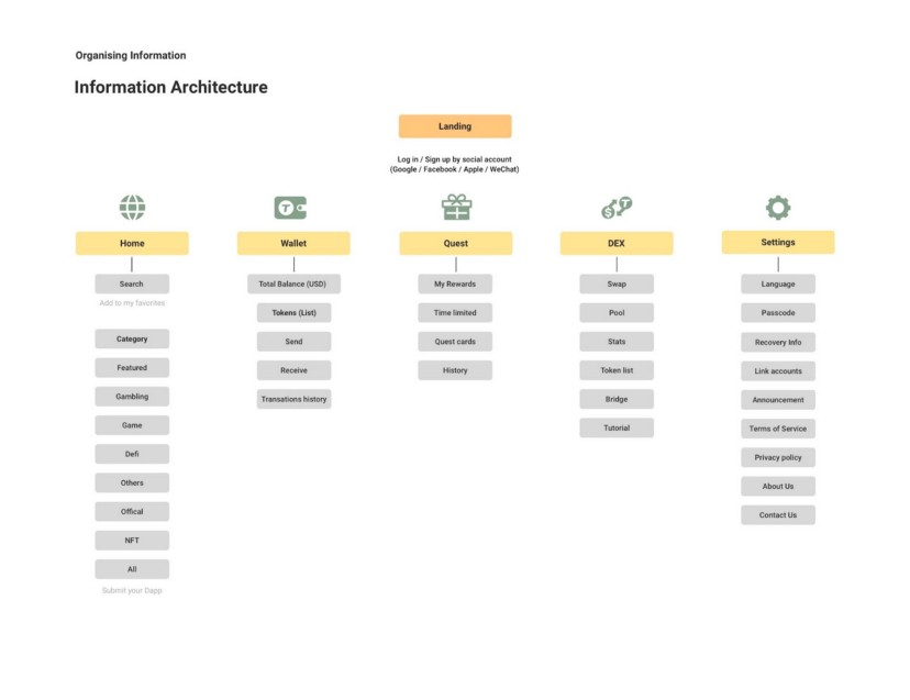
Information Architecture
Information Architecture (IA) is a method used to arrange all flow, content, and design requirements in an application. The IA in this application are as follows:
Wireframe
Before creating a mockup, I carefully went through the UI of the mobile app, its competitors, and other crypto wallet apps. After making some observations, I sketched out all the possible layouts and finally came out with one that worked the best.
This allowed me to prototype solutions for the main screens before committing to high fidelity designs, it helped me a better understanding of who I was designing for and felt equipped with my background research.
I made a wireframe first to get an idea of the basic outline of the design that I would be working on. The following is a wireframe of the redesign of the TT Wallet application:

Mockup
Mock-up is a high-level representation of a product design. At this stage, we create a combination of styles, typography, colors, and others. After going through several stages of research and ideation, here is a mockup design for the redesign of the TT Wallet application:
To find out what improvements I made, I outlined the bullet points for each problem and compared the old design with the new design.
The following is an explanation of the redesign of the TT Wallet application that has been carried out in answering the three main problems in this research:

Home Screen
The Home tab allows you to explore the range of DApps based on the category of your choice. It also displays a range of featured DApps. When you select a category tab, you will find a list of DApps within that category and will get to see the description of these DApps.


Wallet Screen
The wallet tab was the most complicated screen to redesign and organize as it holds a lot of crucial information for users. Therefore it needed to be easy to read. During the research stage I also noticed that the wallet screen with the crypto balance was not very well designed as it only showed each token’s balance and did not display a total balance. On this screen I wanted the user’s main focus to be at the top of the screen. Since I personally found that wallets that did not show the total assets are not very user friendly, thus I decided to split this screen into two sections that includes the total balance of all assets in the wallet and the balance of each individual token.

Design Results
- Enhance brand identity of TT Wallet
- To deliver a personalized experience and intuitive user interface
- Propose a more engaging and seamless trading experience so that users are comfortable accessing their tokens and assets.
In order to support more blockchains and prevent users from transferring unsupported assets, we have been working hard on improving both the user interface and user experience. As a result, we made several big improvements to the TT Wallet including:
- Added a cross-chain label to the tokens in the wallet tab.
- Added a refresh button above the tokens in the wallet tab to update the wallet’s balance and value.
- Add warning notes to warn before performing cross-chain withdrawals to prevent users from losing access.
- Design a clear user experience process flow and ensure that the user interface is clear.
We observed that there are several problems or confusions experienced by our users while making transactions, this refers to both the terms of design use and the options available in the application.
After redesigning the TT Wallet, we asked our interviewees to perform tasks based on scenarios in the user testing process, and found out that all the users agreed that the new design is much more modern and the user experience was improved significantly. The reason why most users agreed that their user experience had improved is due to a better user flow and an easy to interpret layout and functionality of the application.
Conclusion
After getting to know our users and their requirements, TT Wallet was able to transform into the version that it is today. By getting to know our user base more closely, we were able to optimize the functions of the wallet which directly reflected growth on metrics of TT Wallet. The improvement of the wallet and features allowed the TT Wallet’s daily active users to grow by over 48%, helped the retention rate reach over 350% growth and nearly doubled the average duration of time that our users spend on TT Wallet.
Here’s the growth results of the TT Wallet over a year’s time span:

As our user base has grown, we have always kept our users feedback in mind to optimize the TT Wallet’s user experience. The design and user experience of a crypto wallet is an important factor that directly affects the conversion rate and success metrics. From this case study, we got to learn that the unspoken rule of design that “Simplicity is Key” is accurate even for crypto wallets. From the insights that we gained in curating this case study, we aim to continue to drive new products, features and services while ensuring a simple and easy to use user experience.

0 Comments