
A step by step process of transforming my imagination into a complete pack.

“Mr. X ” invited me a month ago and offered me this opportunity to create such application and It’s brand. First, I wasn’t sure about it, because I didn’t know If I could do this or not. But 2 days later I forced myself and took this opportunity as a challenge. Yes, It was a challenge because of its short timeframe. Which were 15 days only! I know it’s insane. 😐
— However…
Forget my shit, let’s talk about the project. This is a Crypto project and I have never ever done a single crypto project in my life. It was kinda hard for me, actually. The client brief was simple “he said, I want to build a crypto platform where a user can buy BTC, BTC cash and ETH and sell theme easily from anywhere anytime”. And I was like OK!! Can you provide more information? He said NO, I don’t have more information! And I was like OK!😐 🤯
My Mission
Actually, It was funny as hell. I was clueless without information and brain was empty. So my mission was make my knowledge very strong and clear from knowing nothing about it 😉. And I was like let’s build the brand first, then web application and finally mobile application.
Bitcoin Users At a Glance
2.9 to 5.8 million active bitcoin users according to a Cambridge University study. Leading exchange Coinbase has over 13 million users. And 32 countries that Coinbase services are available

Challenges…
Crypto industry is really a big deal. It’s not like another ordinary project. In this industry, there are a lot of people involved. Young boys/girls, Middle age man/women, And Senior citizen. These three different aged people think different and see different. So, I had to make a logo/web app/mobile app which can fit anywhere between these three different personalities.
A proper way
Every good project starts with a good plan. So, I started with a tie around my head and followed the steps below.
- Research
- Sketches
- Wireframes
- Finding UX issues
- Design
Research
I prepared myself and started with Google search. I had no idea about bitcoin trade or exchange (😂no shame). My purpose was to learn bitcoin a bit then the users information and their problems. I spent the first 3 days to learn how this thing works and how users interact with this industry. I read a lot of blogs about different bitcoin companies and collected user feedback using trustpilot. Trustpilot is a great way of finding real reviews.
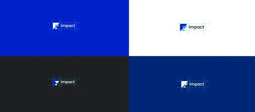
Branding Design
A logo is not just a symbol or a colorful presentation, It’s the perception of an image which helps people to understand the meaning. So, I started with the target. As we talked previously, our target audiences are senior people, middle age people and young people like us. So, I wanted to make a visual, where it can present the message of these three different personalities at once.

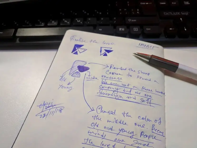


Now User Flowchart
After gathering a lot of information in 72 hours. I had a vision in my head of how the app will function. So, I started with mapping. It helped me understand, how an user will travel through the app. First, I started with sketches on my notebook and then I finalize the Flowchart with Flowmapp.


Sketch was my imagination before I actually started the designed.

Wireframes

Inspiration Board

Color Palette
I choose dark blue color for the project. The color blue symbolize trust, loyalty, wisdom, confidence, intelligence, faith, truth. So, I couldn’t resist myself using this color as a primary color. Additionally, I used black, grey for secondary color.

Typography
I used Niramit font family and it designed by Cadson Demak. I fall for Its simplicity and modern look. I think it’s a gorgeous font family. Niramit was a complete package for me.

Icons Pack
Icons are an important part of a project. It gives the premium and professional vibe. They communicate with users and help them understand the words easily. So, I made custom icon pack for this project. And also I used font-awesome. They have a great collection of a premium looking icons, which are absolutely free of cost
Web Application Designs
After hard and sole work. I achieve this design. Check the design from down below.
— Sign up process screens


Man why it’s so simple? I know it’s simple and it’s not that attractive UI. As we talked previously we have three different personality. Not all the senior or middle age people used to fancy UI. They are old and they understand simple, old school things. So, I stick with the simple UI here. In this page, users can find the Market Data, His/her portfolio and recent activities.
— Buy & Sell Screens

It’s really simple! Users can buy and sell their BTC/Cash/ETH easily from here. By selecting the Buy or Sell tab, they can sell and buy BTC. Oh, forgot to talk about he Invoice preview. I added an invoice feature here. It always update automatically (without refreshing the page )after the inputs given by users.
— Adding Debit Card is Easy

I added a big layer of security here. Because, some users can use stolen cards. So, I didn’t forgot about them. Impact can verify a debit card by uploading a Govt ID/Driving licence/passport. After the verification, user can use their cards. The verification process will be handled by some third party company like HooYo/Trulioo etc.
— But Adding Bank is Easer

It’s easy! All you need is to collect your secure Bank details. And add theme to your account. Bamm! you are done.
— User Profile Screen

Account page is simple with the user information. Some security information and his all the transaction history. The most important thing here is the login details and all previous transaction history.

Mobile Application Designs
— Sign up process

I created the mobile application sign up process similar to web application. In mobile application sign up, I took the benefits of Facial Recognition. It’s a sold layer of security of the users, I think.
— Onboard Process

A simple onboard design to set initial expectations from the app and to get the base idea of this app and how this works.
— BTC Market Data

Users can study more about market data easily and can check track record of the market data. And I designed this combined with fancy and old school UI.
— Check all the screens down below

Estimate Design Timeline
- Planning — 48 Hours
- Wireframes & Design — 40+ Hours
- Testing — 8+ Hours
- Final Touch — 13 Hours


0 Comments