
Overview
Zoom is a leading platform for setting up virtual meetings, video conferences, direct messages, and collaboration tasks. Join a Meeting (also more likely mentioned as Zoom meeting) is one of Zoom’s product which provide an experience for video conferencing and messaging across any device. In recent times, Join a Meeting has been the most popular product on Zoom for connecting with colleagues, clients, and friends around the world. To meet the expectation, it also presents many features that could support the product’s needs. As one of those feature is chat room in zoom meeting, that lead the meesting’s participants to send a short message, that could be directed for everyone or just for one person. However, there are always shortcomings on some features that could affect the efficiency of the product. In this case, the aim for this research is to comprehend the issues on chat room features.
Role: UI/UX. product Owner
Scope: User Research, Analyzing, User flow, Information Architecture, Wireframing, Mock-up, Design system, and Prototyping.
Timeline: 4 weeks
Tools: Figma, Maze, Google Form, Google Spreadsheet, Unsplash (for pictures)
The process

Stage 1— Empathize
At this stage, the process was carried out from primary data that could be conducted from Planning Research and Conducting Research.
Background
The communication itself has been the mandatory for all of the activities in the world. To make it convenience and reachable in every possible way, people need something more valuable and easier to use, especially in this pandemic era since meeting face-to-face is limited based on government regulations. To overcome this condition, the appearance of Zoom App is the answer to all the activities that was limited by distance. Here is the current interface of zoom mobile app:

As long as time goes by, zoom app has been concerned by people who has been used it for times. There are always advantages and disadvantages while using an app. For Zoom cases, since it always used for meeting purposes, people most likely tend to have an eye on its features. This one below is an example of the issue from Join a meeting features as from user’s viewpoint:

The user really explains the details about how this could be a lack of feature on Join a meeting. As this issue has been jumped on the social media platform, the author would like to give a try to come up with a solution for this matter, or others that might come.
Planning Research
Objective
The objective would be to gain chat room’s issues on zoom meeting.
Methodology
Quantitative Research — Questionnaire.
A quantitative questionnaire method was used regarding to obtain the good amount of data for the product. The purpose is to gather information about users’ information, app’s current issues, and to add insights to design processes. It also has its time-efficiency for both user and author since it could be conducted anywhere and anytime. The questions are mostly direct questions.
Targeted Participant
- User who has used Zoom app on some occasions.
- User who has used chat room on zoom meeting.
- Age from 17–35 year old.
Research Goals
The main purpose for this research would be noted from the following research goals. These would help to create the lists of question for the coming survey.
- Understand user’s thought about zoom app
- Understand user’s attitude by using Join a Meeting.
- Understand the features on Chat room from user’s perspectives.
Conducting research
The questionnaire was created by using Google form. It was shared to approach targeted participant as well, and to obtain the information as the purpose of quantitative research typically focuses on gathering quantifiable data.
Survey Reports
Based on the survey reports that had been conducted from 19 participants from different backgrounds residing in Indonesia with the age group from 17–35 years old, the issues were found out as on the graphs below.


Stage 2— Define
Persona
The persona was created based on the survey results, to know better about user expectations and pain points while using chat room on zoom meeting.

Journey Mapping

Identifying the problems
Based on the survey-results, there are 3 most main issues on zoom meeting’s chat room. Those are:
- Delete message
So far, from the current version of zoom app (either mobile or desktop version) has not added this feature yet. By having the most votes on the survey, it seems like people are aware about the importance of having this feature on chat room.
2. Reply message
This feature also hasn’t been in the current version yet.
3. Personal chat
Eventhough zoom has an alternative method for this feature, it still concerns the user about the usability for this one. There are users who asked for this option because sometimes, the difference is unnoticeable, whether you sent it to everyone in the room, or just for a specific one. Somehow it made them uncomfortable.
Stage 3 — Ideate
Information Architecture
The IA didn’t change so much difference from the existing app, because the main problems weren’t on the flow or the layout of the app. Mainly just giving some spaces for the added features to solve the issues. This would help the current user to feel familiar with the app, but with the upgraded features.

User Flow
The user flow would describe the process to get into the targeted one. These user flow mainly focused on the personal chat, reply message, and delete message.

Wireframe
The main purpose of a wireframe is to design the structure of the user interface. There’s no need to create in-depth designs. Just keep it simple and clean with minimal elements. The main goal is to create placeholders for all the content and map it out. The wireframe as known as low-fidelity mockup, was crafted based on the information architecture with the added features.

Design System
Design system would help to organize every single components on the design interface.

The images were taken from unsplash plugin, whereas the icons were taken from material design icon, iconly, and iconify.
Mockup
The mockup or high-fidelity one, would be based on the information and layout that were settled on wireframe.

- Homepage

Homepage is the first page for user to visit. The changes were on the placement of the features, the one with mostly user would use would be placed first. The share screen was replaced with chat option because normally, if user wanted to share their screen, they should enter the meeting first. And since it was for meet and chat page, the option for chat was added.
2. Chat room

For the chat room page, the interface was mostly the same. The difference was on the display name for chat, was changed to everyone . This would lead the option into personal chat.
3. Personal Chat

For the personal chat page, the redesign one was made to another page from chat room for everyone. So it lead to chat personally with participant that had been chosen.
4. Reply & delete message

For the reply and delete message option, it would appeared if user tapped the bubble chat. The reply option would appear if user tapped another participant bubble chat, and the delete option would appear if user tapped their own bubble chat.
Stage 4 — Prototype
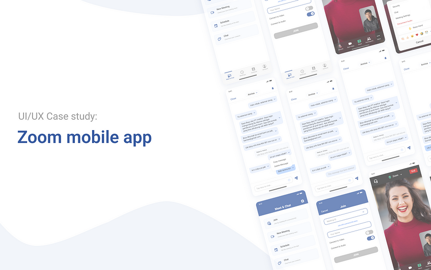
The prototype was made to help user felt the experience of using the app (with the added features). Here is the prototype for the redesign zoom app:
Stage 5 — Testing
The testing was carried out by doing usability testing on Maze. There were 3 test cases that were given on the test. Usability testing was distributed to the potential users that had been filling their information on the survey before. The test were managed to be done by 5 users.
Task Given
Users were asked to perform the following tasks after the scenarios were being given, such as:
- Enter the zoom meeting by inputting the meeting code and display name.
- Select the flow to chat room, and go to personal chat with the host
- Chat as usual start from greeting, introducing yourself, and ask for the contact person by replying the message.
- Delete the incorrect message, then send the right one.
An example scenario would be : “Imagine that you are an employee, and go to public seminar that you’ve found from some online platforms. And you see that the speaker has potential to do upgrading course in your company. Then you are going to ask the host how and where you can contact them.”
Summary & Insights
Task 1: Enter the zoom meeting by inputting the meeting code and display name.

At the first task, all users admitted that they usually didn’t use this step to join a zoom meeting, they’d rather use the link rather than this flow. But, in the mean time, all users managed to complete this process.
Task 2: Select the flow to chat room, and go to personal chat with the host.

At the second task, all users managed to complete this process without any problems. Even if the option for personal chat was different from the original one, they didn’t seem to think too much to notice the personal chat option by clicking the ‘everyone’ button. Just in case there were users who forgot whose name should be clicked, but it’s all settled.
Task 3: Chat as usual start from greeting, introducing yourself, and ask for the contact person by replying the message.

At the third task, this happened mostly for almost all users, which chat should they reply. But after remembering the right one, they succeed this process.
Task 4: Delete the incorrect message, then send the right one.

And for the last one, it’s not that much problems after they realize the incorrect one, they completed the task without much problems. Based on their opinions, there was no real obstacles, just some minor cases and those were not in the flow, just technical one.
The result was presented on System Usability Scale (SUS). From the result of the SUS, the calculation is around 86 and the adjective rating for that score is Excellent. This would mean that the redesign and the added features for the app was quite acceptable for user, and user could use it as well.

Design Recommendation
There is a design recommendation for the color of bubble chat between user and other participant. It would be better to differentiate their color so it should be easier to recognize.

Lesson Learned
This is the second study case i’ve ever done, still too much i need to learn, especially on planning the research, and doing the design interface. Comments, claps, and feedbacks are really appreciated.


0 Comments